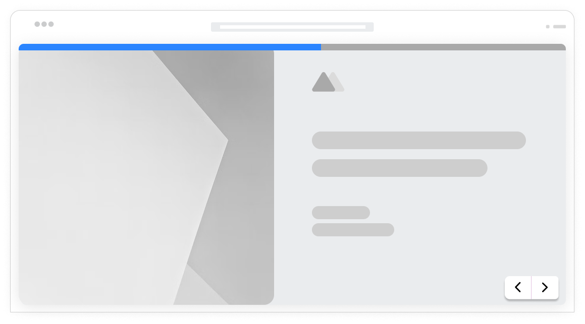
Perfect on every screen
Forms that adapt beautifully to phones, tablets, and desktops. Touch-friendly, fast-loading, and designed for how people actually use devices.
Why mobile matters
Over 60% of form submissions happen on mobile devices. Forms that are not optimized for mobile frustrate users, increase abandonment, and cost you leads. Formsuite forms are mobile-first by design, ensuring every user gets a great experience regardless of device.
Meet users where they are
Your audience is on their phones. During commutes, in waiting rooms, scrolling in bed. Mobile-optimized forms capture leads when and where interest strikes, not just when people are at desktops.
Reduce mobile abandonment
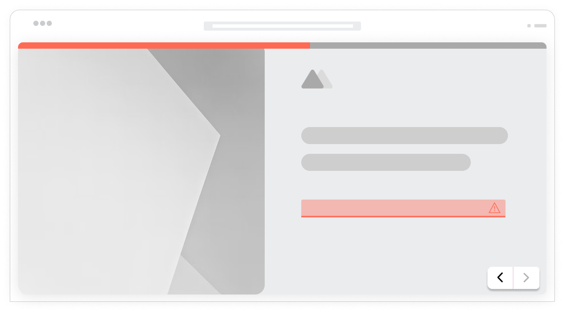
Tiny buttons, awkward zooming, and horizontal scrolling kill mobile completion rates. Responsive forms eliminate these friction points, making mobile submission as easy as desktop.
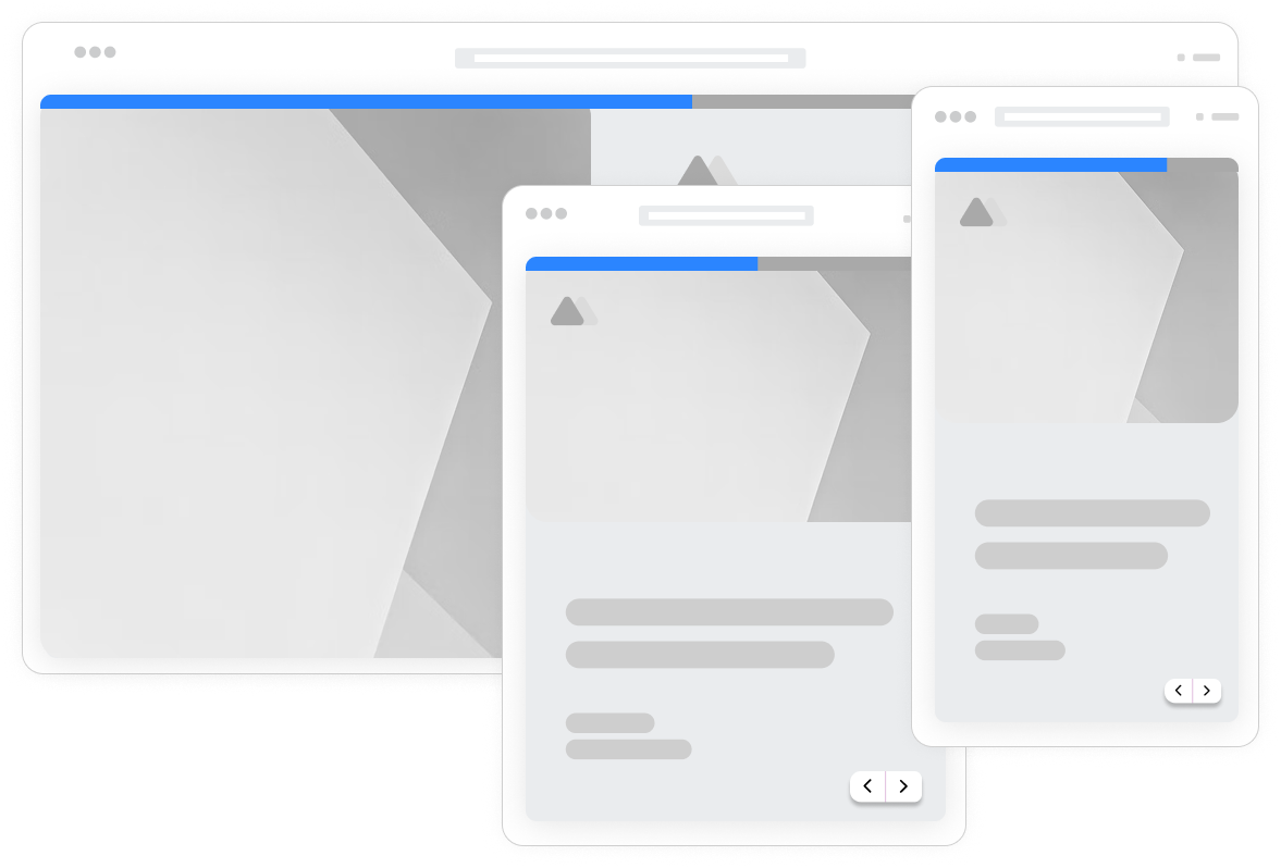
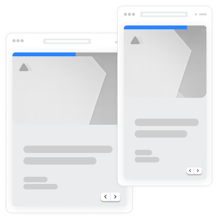
One form, every device
No need to create separate mobile and desktop versions. Every Formsuite form automatically adapts to the screen it is viewed on. Build once, work everywhere.
Designed for touch
Every element is optimized for mobile interaction. Touch targets, keyboard types, gestures, and layouts all consider how people actually use phones and tablets.
Touch-friendly inputs
Buttons, checkboxes, and inputs are sized for fingers, not mouse pointers. Adequate spacing prevents accidental taps. Every interaction feels natural on touchscreens.
Smart keyboard types
Email fields trigger email keyboards. Phone fields show number pads. Date fields open date pickers. The right keyboard for each input type speeds completion and reduces errors.
Responsive layouts
Multi-column layouts on desktop stack vertically on mobile. Images resize appropriately. Text remains readable without zooming. Layouts adapt intelligently to any screen size.
Fast mobile loading
Lightweight code and optimized assets ensure forms load quickly on mobile networks. No waiting on slow connections. Users can start filling immediately, even on 3G.
Mobile preview mode
Preview exactly how your form looks on mobile devices while editing. Switch between desktop, tablet, and phone views. Catch mobile issues before publishing.
Browser autofill support
Forms work with browser autofill for names, emails, addresses, and payment info. Reduce mobile typing by letting browsers fill known information automatically.
Offline resilience
Form data is preserved if connections drop. Users do not lose their progress due to spotty mobile coverage. Submissions complete when connectivity returns.
Cross-device testing
Test forms on actual devices or using browser emulation. Verify touch interactions, keyboard behavior, and responsive layouts across iOS and Android devices.
Frequently Asked Questions
Everything you need to know about mobile-responsive forms. Questions about specific devices? We are here.
Still need help? Contact Us
Yes, every form you create is automatically mobile responsive. There is no special setting to enable or separate mobile version to build. Forms adapt to phones, tablets, and desktops out of the box. The responsive design is built into the core platform.
The form editor includes device preview modes. Click the device icons to switch between desktop and phone views. You can edit in any view and changes apply everywhere. For final testing, use your actual phone to verify touch interactions work as expected.
Yes, file uploads work fully on mobile. Users can select files from their device storage. The file picker adapts to the device's native file selection interface.
Input fields are configured to trigger appropriate keyboard types. Email fields show email keyboards with @ symbols easily accessible. Phone fields trigger number pads. URL fields show keyboards with .com buttons. This reduces typing effort and errors on mobile.
Conversational forms are especially well-suited to mobile. The one-question-at-a-time format fits perfectly on small screens. No scrolling through long forms, no zooming on tiny fields. Each question gets full-screen focus for easy mobile interaction.
Forms are optimized for fast loading on any connection. The embed script is small, assets are optimized, and lazy loading defers non-essential elements. Forms typically load in under 2 seconds even on 3G connections, with visible content appearing nearly instantly.
The responsive system handles layout adaptation automatically. Multi-column layouts stack on mobile, images resize, and spacing adjusts. For most forms, no manual mobile configuration is needed. The automatic responsive behavior produces optimal layouts for each device size.
Templates to get you started
Start from a ready-made template and customize it to fit your needs.

Lead Capture Form
Engage visitors and turn them into qualified leads with a simple, high-converting form.

Customer Effort Score (CES) Survey
Measure how easy it is for customers to interact with your product, and use those insights to reduce churn and strengthen loyalty.

Event Signup Form
Increase attendance and easily collect the key details you need from every guest.
Build great mobile experiences
Mobile responsive design works with other Formsuite features to create seamless cross-device experiences.